DIN Next LT Pro Black
Online Fonts Generator \ Conversion and Preview Controller
Except for the fonts in the "Free Fonts" section, the images generated from fonts in all other sections are for viewing pleasure only. Do not use them for commercial purposes!
DIN Next LT Pro Black Font Metadata
- Name: DIN Next LT Pro Black
- Subfamily: Regular
- Subfamily ID: 1.200;LINO;DINNextLTPro-Black
- Full Name: DINNextLTPro-Black
- Version: Version 1.200;PS 001.002;hotconv 1.0.38
- Weight: 900
- Postscript: DINNextLTPro-Black
- File Size: 72 KB
- File Extension: .otf
- Number of Characters: 832
- Number of Glyphs: 542
- Manufacturer: Linotype GmbH
- Designer: Linotype Design Studio
- Description: DIN Next is a typeface family inspired by the classic industrial German engineering designs, DIN 1451 Engschrift and Mittelschrift. Akira Kobayashi began by revising these two faceswho names just mean condensed and regularbefore expanding them into a new family with seven weights (Light to Black). Each weight ships in three varieties: Regular, Italic, and Condensed, bringing the total number of fonts in the DIN Next family to 21. DIN Next is part of Linotypes Platinum Collection. Linotype has been supplying its customers with the two DIN 1451 fonts since 1980. Recently, they have become more popular than ever, with designers regularly asking for additional weights. The abbreviation "DIN" stands for Deutsches Institut für Normung e.V., which is the German Institute for Industrial Standardization. In 1936 the German Standard Committee settled upon DIN 1451 as the standard font for the areas of technology, traffic, administration and business. The design was to be used on German street signs and house numbers. The committee wanted a sans serif, thinking it would be more legible, straightforward, and easy to reproduce. They did not intend for the design to be used for advertisements and other artistically oriented purposes. Nevertheless, because DIN 1451 was seen all over Germany on signs for town names and traffic directions, it became familiar enough to make its way onto the palettes of graphic designers and advertising art directors. The digital version of DIN 1451 would go on to be adopted and used by designers in other countries as well, solidifying its worldwide design reputation. There are many subtle differences in DIN Nexts letters when compared withe DIN 1451 original. These were added by Kobayashi to make the new family even more versatile in 21st-century media. For instance, although DIN 1451s corners are all pointed angles, DIN Next has rounded them all slightly. Even this softening is a nod to part of DIN 1451s past, however. Many of the signs that use DIN 1451 are cut with routers, which cannot make perfect corners; their rounded heads cut rounded corners best. Linotypes DIN 1451 Engschrift and Mittelschrift are certified by the German DIN Institute for use on official signage projects. Since DIN Next is a new design, these applications within Germany are not possible with it. However, DIN Next may be used for any other project, and it may be used for industrial signage in any other country! DIN Next has been tailored especially for graphic designers, but its industrial heritage makes it surprisingly functional in just about any application.
- MD5: 01a647c5d232b23e93e5bc3c0239bc14
- Copyright: Copyright © 2008 - 2009 Linotype GmbH, www.linotype.com. All rights reserved. This font software may not be reproduced, modified, disclosed or transferred without the express written approval of Linotype GmbH.
DIN Next LT Pro Black Font Image

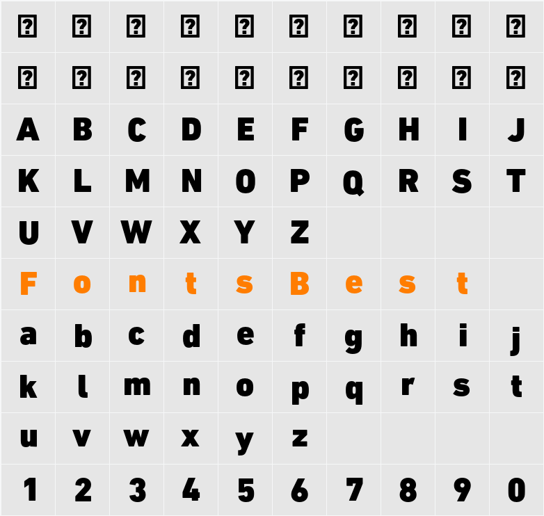
DIN Next LT Pro Black Character Map
DIN Next LT Pro Black Download
Fonts downloaded from the "Free Fonts" column can be used commercially without purchasing copyrights. They are carefully verified by multiple parties before being released. However, it cannot be ruled out that the copyright holder or font author modifies the license one day, or that there are inadvertent omissions in the verification process. Therefore, in actual commercial use, it is recommended to contact the copyright holder or font author for further verification.
The fonts are from the Internet or personal contributions. They are only for personal non-commercial download. Please do not use them for commercial purposes. If you use them for commercial purposes, please contact the font author or the font copyright owner. If there is any infringement, please contact us to disconnect the link.Email:fontsvip@gmail.com
Although we have indicated the license type, please make sure to double check it by reading the information shown in the details area of each font to avoid any confusion. If you are not sure, do not hesitate to contact the font author.