NoSense
Online Fonts Generator \ Conversion and Preview Controller
Except for the fonts in the "Free Fonts" section, the images generated from fonts in all other sections are for viewing pleasure only. Do not use them for commercial purposes!
NoSense Font Metadata
- Name: NoSense
- Subfamily: NoSense
- Subfamily ID: 1.000;pyrs;NoSense
- Full Name: NoSense
- Version:
- Weight: 500
- Postscript: NoSense
- File Size: 51 KB
- File Extension: .ttf
- Number of Characters: 206
- Number of Glyphs: 130
- Manufacturer: THOMAS CANALE
- Designer: ©THOMAS CANALE
- Description: Setting type has been an occupation and a passion of mine over the last 30 years. After completing some schooling at Cooper School of Art in Downtown Cleveland I accepted a position at Peto's Type House. Back then, the Cleveland Press still set type with 'Hot' lead. I know, I know, this dates me, but the facts are the facts. PhotoType was in it's infancy with the Linotronic 5700 being top-of-the-line technology in Photo type setting. My job at Peto's was more modest, among other things, I was hired to set headline type on what was called a 'Typositor'. It was still photo type setting but for headlines only. Letters had to be set (exposed), one letter at a time. A single headline of lets sayÉ15 words or so could take an hour or two to completely finish for paste-up, that's right, I said paste-up. That should really date me!! By doing this day in and day out (for hours on end) I gained a "close-up' appreciation for letterforms and spacing. Ernie Peto would also quiz me on identifying type by name. It was an interesting 18 months to say the least. There have been lasting effects on my appreciation of letterforms thanks to this experience.
Over the years, there have been spin offs of wood type, Times Roman, Helvetica, etc. Seems to me like we are just going over the same ground over and over and over again. What interests me is not the 'sameness' in the letterforms or their 'invisibility' in the graphics world. Some fonts are used to be 'invisible'. What I mean by this is that they are merely a communication tool to deliver the authors' / writers' message. the artistry in the forms lies in their ability to stay invisible and be easy to read.
But their 'uniqueness' and how that difference translates to the printed page. There are many ways of looking at letterforms. We can look at the beauty of the individual letters themselves. Commenting on the curves of a upper case 'A' or a lower case letterform. Or we can look at them as a 'unit' and how that translates within a block of written text. It is this uniqueness that I am looking for in the fonts I design.
I do look at each individual letterform and revel in the beauty of the forms and lines. But I also want to create a Font that when written out will display some unusual and unexpected characteristics when in a large block of text. Look for different line weights and forms in my font glyphs. The idea here is to allow the printed page to display uniqueness in contrast.
- MD5: d1334973fffb35ff1b11fefcdfaacd04
- Copyright: ©THOMAS CANALE, CANALE STUDIO, INC.
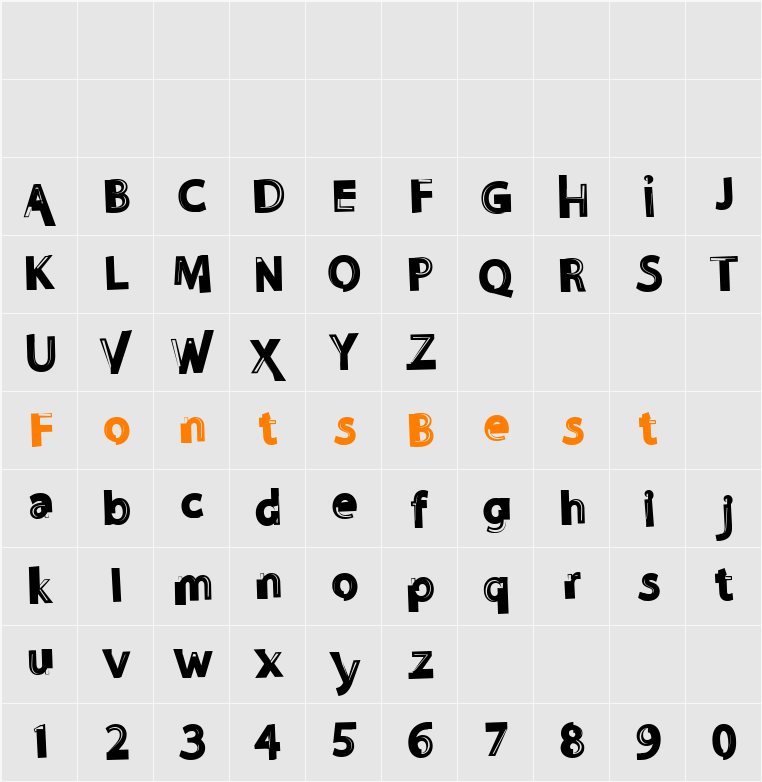
NoSense Font Image

NoSense Character Map
NoSense Download
Fonts downloaded from the "Free Fonts" column can be used commercially without purchasing copyrights. They are carefully verified by multiple parties before being released. However, it cannot be ruled out that the copyright holder or font author modifies the license one day, or that there are inadvertent omissions in the verification process. Therefore, in actual commercial use, it is recommended to contact the copyright holder or font author for further verification.
The fonts are from the Internet or personal contributions. They are only for personal non-commercial download. Please do not use them for commercial purposes. If you use them for commercial purposes, please contact the font author or the font copyright owner. If there is any infringement, please contact us to disconnect the link.Email:fontsvip@gmail.com
Although we have indicated the license type, please make sure to double check it by reading the information shown in the details area of each font to avoid any confusion. If you are not sure, do not hesitate to contact the font author.